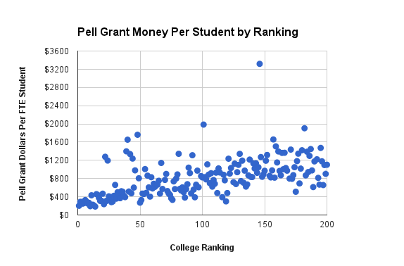
So I am playing around with the IPEDS Delta Cost Database, which is loaded with tons of data on thousands of higher education institutions in the United States. I noticed that their data allowed for a comparison that I have been curious about for a while now, which is how much institutions are getting in Pell Grants per student.
There are a variety of way to try to figure out how much a given college is serving poor folks. One way you see on institutional websites is what percent of the students are receiving Pell Grants (need-based federal grants given to lower-income students). The problem with this number is that it does not distinguish between Pell Grant recipients. There is a considerable difference between someone who gets the minimum Pell Grant and someone who gets the maximum Pell Grant, and lumping them all together misses this. A better way to do it then, it seems to me, is to take the full amount of Pell Grant money an institution receives and divide it by the total number of students at the institution (including those receiving no grants). This would provide a neat metric for how much their student body skews poor. So that’s what I did.

I plotted the top 200 schools as defined by US News with their ranking and their pell grant money per full-time equivalent (FTE) student to get the above graph. I wanted to see if there was some noticeable trend. For instance: as the schools go down in ranking, does their Pell/FTE go up? I haven’t done any sophisticated analysis on it, but it looks like the lower ranked the school is, the higher their Pell/FTE is (as you move right, the dots go higher). This indicates that lower-ranked schools in the top 200 skew more poor than higher-ranked schools in the top 200.
There are interesting standouts in the data. Two worth mentioning here are the University of California at Los Angeles and University of California at Berkeley. UCLA has a Pell/FTE of $1195 and UC Berkeley has a Pell/FTE of $1278. These are extremely high Pell/FTE numbers for a top 25 school. The next highest school in the top 25 is Emory, which has a Pell/FTE of just $467. So those two UC schools are way more skewed towards lower-income students than any of the schools near them in the rankings.