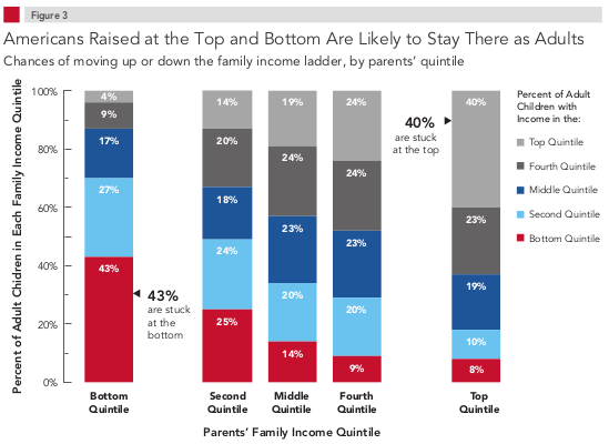
The excellent Pew Economic Mobility Project is out with its latest numbers on US social mobility. This chart sums up the current state of US social mobility the best:

For those unacquainted with the terminology, the chart reads like this: The left column details the eventual economic outcomes of children born into the bottom 20% (quintile) of households. So, 43% of kids born into the bottom quintile remain in the bottom quintile as adults (the red), 27% move up into the next quintile (the light blue), 17% move into the middle quintile (the dark blue), 9% into the next quintile (the dark grey), and finally 4% into the highest quintile (the light grey). The next four columns repeat this process, but for children born into the other 80% of households, with each column representing a 20% slice of the income distribution.
Children born into the richest 20% of households are 10x more likely to be in the top 20% as adults than children born into the poorest 20% of households. This data is an inconvenient truth for the American Dream narrative that pretends everyone has an equal chance at success and failure.