I wrote about poor people in the top 200 colleges a few days ago. As I explained then, I am interested to see how much Pell Grant money schools get per student. I think this is a better measurement to see how much a school skews poor than simply looking at the percentage of students getting Pell Grants because some Pell Grant recipients are poorer than others. To be clear, the methodology here is just to take gross Pell Grant dollars and divide by all FTE students.
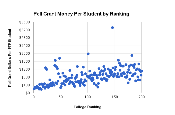
In the first post, I used the US News Rankings to come up with the plot. It looked like this:

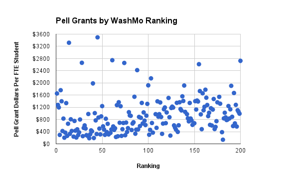
In response to a comment on that post, I went ahead and did the same plot but for the Washington Monthly rankings. Those rankings apparently use Pell Grants as part of their ranking formula. Here is what that plot looks like:

As you can see, this plot looks quite a bit different and is much noisier. You can see this especially at the very left-end of the plot (highest ranked schools). The University of California schools along with the University of Texas and South Carolina State University are concentrated near the left and have very high Pell/FTE scores.