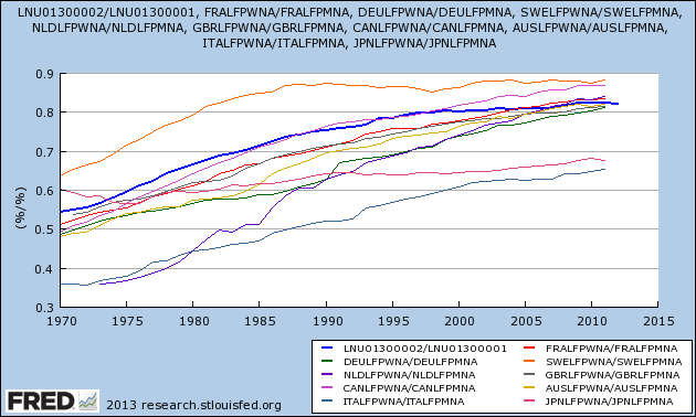
The New York Times had a very good Sunday piece from Stephanie Coontz called Why Gender Equality Stalled. Much of the piece is dedicated to highlighting the ways in which our economic institutions force women to make hard choices about labor force attachment. Throughout the piece, Coontz makes comparisons between the United States and other countries. So I thought it would be helpful to compare women’s labor force participation against men’s labor force participation for all of the countries that the FRED database has data for.

Basically what I have done is divided each country’s female labor force participation rate by its male labor force participation rate. So for example, if the female labor force participation rate was 7% and the male labor force participation rate was 10%, on this graph that would show up as 0.7. Using a ratio like this better captures how egalitarian labor force participation is in a given country. The higher the line is, the more equal female labor participation is to male labor participation.
To figure out what country is represented by each line, look to the legend on the bottom right. In particular, look at the first 3 letters of each line. Those are country codes. So DEU, the green line, is Germany. NLD is Netherlands. CAN is Canada, ITA is Italy, FRA is France, SWE is Sweden, GBR is Great Britian, AUS is Australia, and JPN is Japan. The bolder blue line is the United States.
So what does this graph tell us? Well it tells us that most of the countries have converged on a female labor force participation rate (FLP) that is just above 80% of the male labor force participation rate (MLP). The exceptions on the high end are Sweden and Canada, who have a FLP/MLP that is closer to 90%, and the exceptions on the low end are Italy and Japan who have a FLP/MLP that is in the 65-70% range.
I thought this graph might be a helpful supplement to Coontz piece, which is why I am posting it here. It helps work through some of the claims being made. I wont go through all of them here, but I will cover one. Coontz writes:
Women’s labor-force participation in the United States also leveled off in the second half of the 1990s, in contrast to its continued increase in most other countries.
This appears to be true. The bold blue line that represents the United States only barely inches up after 1995, while most of the other lines on the graph have moved up quite a bit since 1995. It is not clear however how significant this is because in 1995, the US was already ahead of most of the others. The other countries continued marching forward, but they did not march way past the US: they simply caught up. For a comparison, look at Sweden (the orange line at the top). Their FLP/MLP hasn’t increased since around 1987. When you are already nearer to full gender parity than every other country — as Sweden was and still is — it is necessarily harder to increase gender parity at a rate that is higher than other countries that have a more unequal starting point.