Labor Strike Dataset
Earlier today, I put up a complete dataset of strike activity in the United States from 1976 to the present. It has already been making the twitter rounds interestingly enough, but here I want to comment on it with a focus on how it is unique and useful.
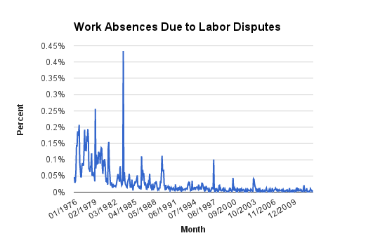
First, how does it work? Going all the way back to 1976, the Current Population Survey has been asking people on a monthly basis 1) whether they are employed, 2) whether they were absent from that employment in the prior week, and 3) why they were absent. So I took the number of people (using the provided statistical weights) who said they were absent from their employment last week due to a labor dispute and divided it by the number of people (again with the statistical weights) who said they were employed. Do that for every single month and plot it on a line graph and you get this (an interactive version is on the dataset page):
There are some things to note about this. First, unlike many other metrics that measure strikes, this measures strikers. In many cases, I think that will be a much better measurement for really understanding how much striking is going on. Metrics that focus on strikes would count two strikes of 2000 people as indicating greater strike activity than one strike of 600,000 people. That's very strange.
Second, because it focuses on strikers instead of strikes, it can be used to rank strikes by size and compare them more easily against one another. The months that have the largest spikes are the months with the largest numbers of workers absent due to labor disputes. Those months usually (I haven't checked them all) coincide with a big national or regional strike. The month with the highest percentage of striking workers is without a doubt August of 1983. According to the Bureau of Labor Statistics, that month saw 640,000 workers represented by the Communication Workers of America strike AT&T. The biggest strike in the last 20 years was in August of 1997 when 185,000 workers represented by the Teamsters struck UPS.
Finally, this kind of data allows us to use averages that can tell a much richer story about just how much strike activity has diminished over time.

Consider this: the month with the highest percentage of workers out on strike in the last 20 years was, as mentioned above, August of 1997. The average month between 1976 and 1979 had a higher percentage of workers out on strike than August of 1997. To repeat: the average month from 1976 to 1979 had more striking workers than the largest month of striking in the last 20 years. If that doesn't drive home how much the frequency of striking has fallen, nothing will.