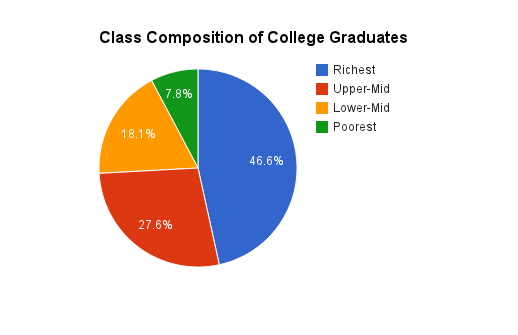
I have been trying to find good info for a while now on this. And here it is courtesy of Bailey-Dynarski research and the National Longitudinal Survey of Youth.

This graph represents the class composition of individuals born between 1979 and 1982 who completed a bachelor’s degree by age 25. So this is a solid data set of the class composition of traditional students who graduated in the early-to-mid 2000s. And no, this composition is not more skewed towards the rich than it was in the past. As I detailed in my last post, things are actually somewhat better than they once were, even during the Golden Era of College Accessibility.
This serves as a reminder of something I have been saying for a while now. When you are arguing about and working on issues surrounding the administration and financing of higher education, you are spending your energies on the particulars of an institution that primarily serves the well-off. Why those discussions attract so much left attention is a deep mystery to me. I’ve incessantly probed that mystery, but I have yet to find a satisfactory answer. I am beginning to think cynical explanations might be the only viable ones.