I needed to prepare this graph for another project I am working on, and so I figured I would share it here too.

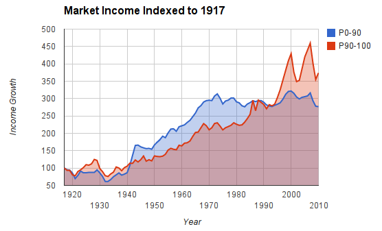
The numbers for this graph come from the famed Piketty-Saez market income data set. I’ve simply indexed income to 100 at 1917. For those not familiar with these kinds of charts, the vertical axis value reflects the year’s income as a percentage of the 1917 income. So if a year’s vertical axis value is 200, it means the year’s income is 200% of the 1917 income.
In the above graph, the blue line (P0-90) represents the income of the bottom 90%, and the red line (P90-100) represents the income of the top 10%. As you can see, the incomes of the bottom 90% and the top 10% increased fairly steadily until the mid 1970s. In fact, the incomes of the bottom 90% grew faster than the incomes of the top 10% during that period. At around 1973, incomes for the bottom 90% (blue line) completely stagnated, while incomes for the top 10% continued to grow, and did so quite rapidly.
This is all to say what everyone should already know: income inequality has increased enormously in the past four decades, as the market incomes of the bottom 90% have not increased at all. This massively uneven income growth was not always the case.