The National Postsecondary Student Aid Survey (NPSAS) is out with fresh college cost data, which the College Board has neatly summarized. This data is released every four years and is the best source out there for really finding out what college costs actual students. In what follows, I detail the cost data from the 1999-2000 year to the 2011-2012 year, broken down by institution type and by the family income of the student.
For clarity sake, “net cost of attendance” refers to the annual cost of tuition (if any) plus the annual cost of room and board minus all grants the student receives. The poorest quartile means the poorest fourth of families, lower-mid quartile means the next poorest fourth of families, and so on.
Public Two-Year Colleges
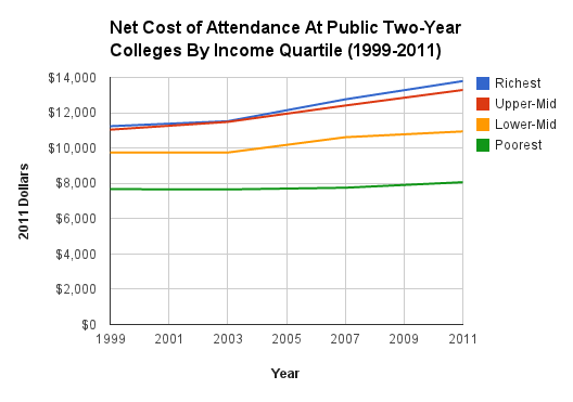
Here is the twelve-year trend of the cost level:
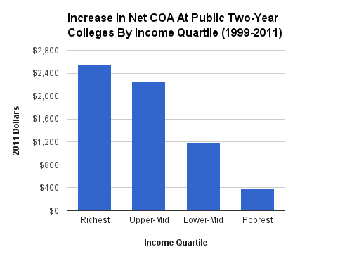
Here is the increasing cost in dollars:
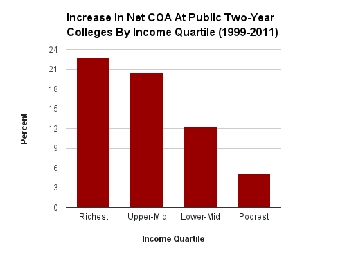
Here is the increasing cost in terms of percent:
Public Four-Year Colleges
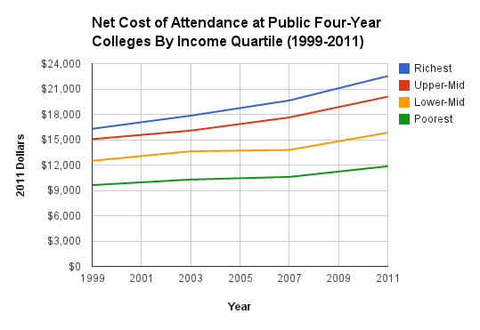
Here is the twelve-year trend of the cost level:
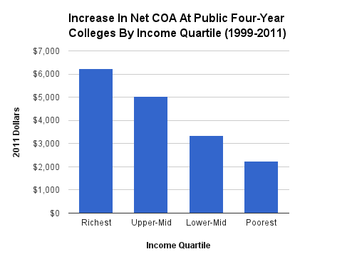
Here is the increasing cost in dollars:
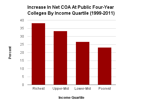
Here is the increasing cost in terms of percent:
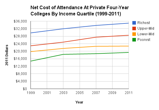
Here is the twelve-year trend of the cost level:
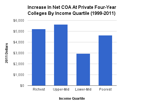
Here is the increasing cost in dollars:
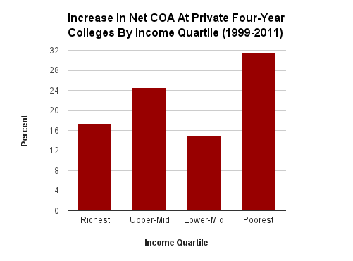
Here is the increasing cost in terms of percent:
Conclusion
Across 12 years, real costs are up everywhere for everyone. In the public schools, costs have increased more for those from higher-income families than those from lower-income families, all the way up the income ladder. This is true both in percent and dollar terms. In the private four-year colleges, the class-based price differentiation trend breaks down, with poorest being hit the hardest in percent terms and the lower-mid quartile being spared the most in both dollar and percent terms.
When it comes to cost levels, in all three types of institutions in 2011-2012, students from the poorest quartile paid 53 to 59 percent of what students from the richest quartile paid.