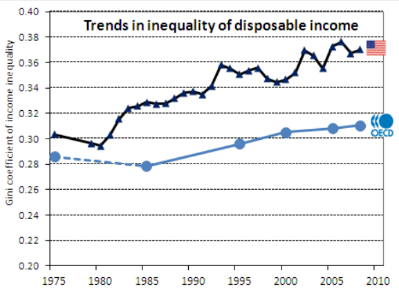
I came across this helpful chart from the OECD, which plots inequality over time for both the US and the 34-country OECD average:

It really deserves pointing out that people are not lying when they remark that the United States is a high-inequality society. If we had enough political will, this could easily be changed, e.g. via tax and transfer programs.